iPro Suite Mobile App

When I was tasked to design the mobile App for iPro Suite, a B2B project and workforce management platform built for constructions. The desktop platform already had around 15 complex features, but the team did not yet have a clear mobile product direction. I led the UX process from research and product definition to information architecture and key mobile screens, redefining the mobile app around field workers, employees, and drivers who need to check daily work, view schedules, log time, and take quick actions on site.
My role
Lead designer
Duration
July - Dec 2025
Tools
Figma
Team
Design Manager, CEO, 4 Engs
|
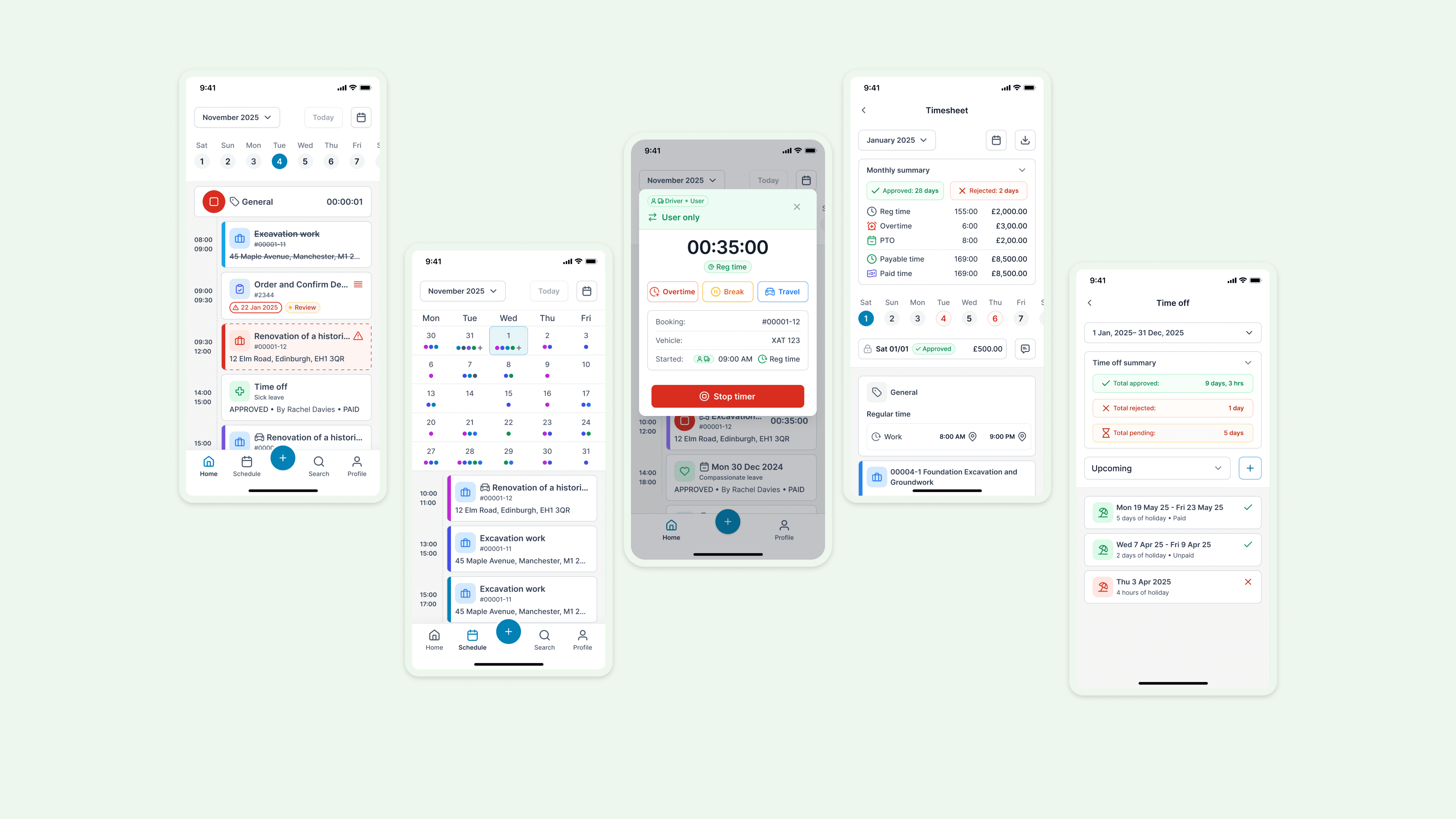
Mobile-first Home Dashboard
The Home Dashboard was designed as the main entry point for field workers and employees. Instead of copying the desktop dashboard, I focused the mobile experience on immediate actions: today’s bookings, assigned tasks, scheduled time offs, and conflicts. This helps users quickly understand what they need to do today without navigating through a complex management system.
|
Unified Schedule View
The Schedule view gives users a fast, reliable way to understand upcoming work. I designed a calendar-based experience where users can read work density at a glance, identify scheduled bookings, and open related work items directly from a selected day. The design moves fluidly between a high-level calendar overview and detailed daily bookings — giving users just enough context to orient quickly without the overhead of a full desktop scheduling tool.
|
Mobile Time Tracking & Logging
The existing Time module was functional but built for desktop-first, manager-driven workflows. Field workers need to capture time in the moment — between tasks, on site, without friction. I designed a mobile-first time tracking flow that lets users start a timer, select a time type, track work in progress, and stop with a clear summary. The experience supports regular time, travel, breaks, and overtime, so workers can record what actually happened rather than reconstructing it later from memory.
|
Mobile Profile, Time Off & Timesheet
The Profile section is designed as a self-service hub for employees. From a single entry point, users can access their profile details, time off records, timesheets, documents, assets, and settings. I designed dedicated mobile views for time off and timesheets. Users can check pending, upcoming, and past time off, review summaries, and browse weekly or monthly timesheet data — without needing to contact an admin or open a desktop browser.
Most Memorable Moment:
Finding the Real Purpose of Mobile
The clearest turning point was realizing this wasn't really a "mobile version" project — it was a product definition problem. The team knew iPro Suite needed a mobile app, but there was no detailed PRD, no defined user target, and no shared agreement on scope. Through a desktop audit, stakeholder interviews, and competitive research, I reframed the brief: mobile shouldn't replicate desktop features; it should focus on the daily needs of field workers, employees, and drivers. That shift turned an open-ended request into a focused, defensible product direction.
|
Impact
What We Achieved
The Impact
Established a mobile-first product direction from ambiguity
The project began with a broad mandate: the desktop product existed, and the team needed a mobile app. I translated that open brief into a focused mobile-first strategy built around field workers, employees, and drivers.
From Desktop Complexity to Mobile-first Workflow
Ownership
Product Thinking
Systems Thinking
Cross-functional Alignment
|
Section 1
Understanding the Problem Behind “We Need a Mobile App”
Stakeholder Interview
Product Scope Definition
Requirement Clarification
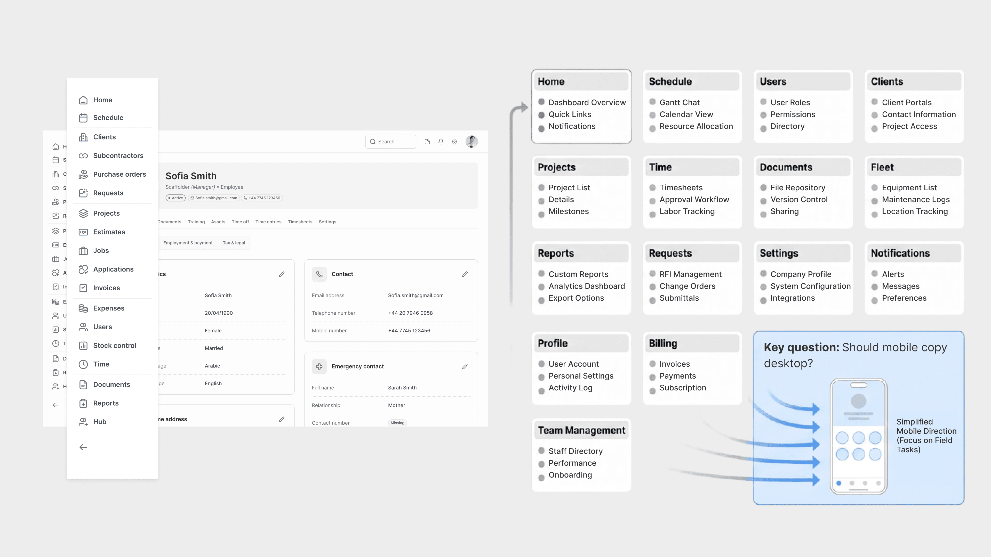
At the start of the project, the team knew iPro Suite needed a mobile app — the desktop product was established, and mobile was the logical next step. But there was no mobile PRD, no defined target user, and no clear agreement on which features to include. The existing desktop product covered roughly 15 modules: Home, Schedule, Users, Clients, Projects, Time, Documents, Fleet, Reports, Requests, Settings, and Notifications.
My first step was to understand whether mobile should mirror desktop or serve a different purpose entirely. Early stakeholder conversations made the answer clear: desktop users were primarily managers and admins focused on oversight, configuration, reporting, and team management. Mobile users were more likely to be field workers, employees, and drivers focused on completing work on site. That distinction changed the direction of the project. Rather than designing a smaller desktop, I needed to define a mobile-first workflow tool.
|
Section 2
Researching How Similar Products Handle Complex Mobile IA
Dealing with ambiguity
Domain Research
Information Architecture
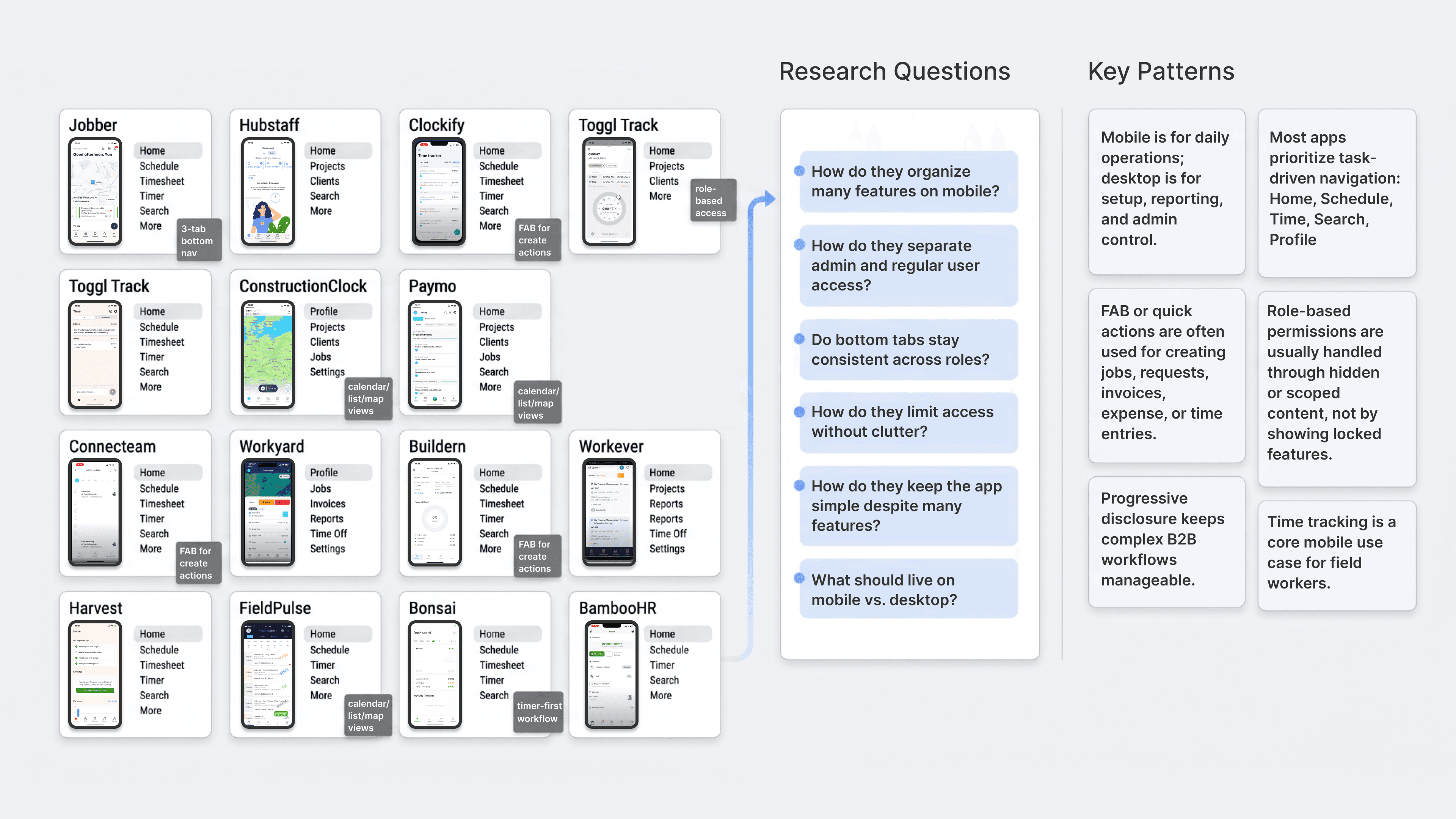
With mobile scope still undefined, I researched a broad range of field-service, construction, workforce management, and time-tracking apps: Jobber, Hubstaff, Clockify, Toggl Track, ConstructionClock, Paymo, Connecteam, Workyard, Buildern, Workever, Harvest, FieldPulse, and BambooHR.
I wasn't primarily interested in visual design. I focused on how these products structured complex features on mobile, how they used bottom navigation, how they handled permission differences between admin and regular users, how they supported quick actions, and whether mobile included the full desktop feature set. A consistent pattern emerged: the most effective mobile apps didn't try to replicate their desktop counterparts. They prioritized task-driven actions — checking today's work, viewing schedules, clocking in and out, submitting timesheets, creating quick records.
This research gave me a stronger rationale for iPro's mobile direction and a clearer argument for positioning mobile as a field-use product, not a full management console.
|
Section 3
Turning a Complex Desktop System into a Focused Mobile V1
Information Architecture
Product Prioritization
Mobile Navigation Design
After research, I explored multiple IA directions. An early, intentionally expansive version included many desktop-inspired modules for both users and admins — useful for mapping the full product complexity, but it quickly revealed that directly porting desktop logic to mobile would produce an app that was too heavy to use effectively in the field.
I iterated toward a tighter structure. The final V1 uses five core tabs: Home, Schedule, FAB, Search, and Settings. Home surfaces today's work and pending actions. Schedule supports calendar list view. FAB for starting timer, adding time off, creating new task. Search provides a fast entry point to key objects — requests, invoices, estimates, projects, jobs, clients, reports, and fleet. Settings handles profile, support, and account configuration. The result is an app that stays simple to navigate while still supporting cross-module workflows.

|
Section 4
Designing Time Tracking as a Mobile-first Workflow
Workflow Design
Cross-platform System Thinking
Time Tracking UX
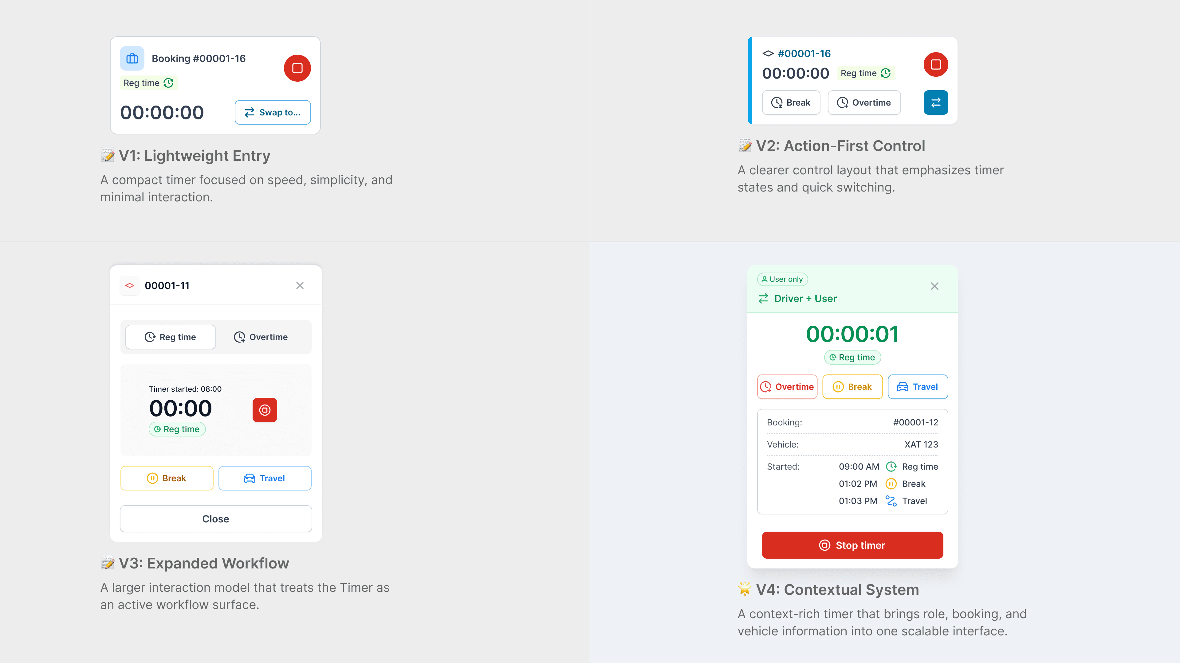
A key insight from the project was that time logging shouldn't feel like a separate admin task on mobile. In the existing system, time was entered manually — a workflow that made sense for desktop management but created real friction for field workers tracking time while moving through their day.
To make time tracking feel native to the mobile experience, I embedded it directly into the daily work view. From the Home screen, users can open the floating action button and take action immediately — start a timer, book time off, create a task. Once a timer is running, it surfaces in context above the daily schedule, so users stay oriented to their bookings while time is being tracked. I designed explicit states for regular time, break, travel, and overtime, and added a summary step when stopping the timer so users can review tracked segments before saving — catching errors before they reach the time record.
|
Projects
|

