Expense Management
When I joined this project, iPro's Expense module was built around backend data categories that meant nothing to the people actually using them: users couldn't agree on where a single receipt belonged, and the team was debating UI details on top of a concept structure that didn't hold. I ran stakeholder interviews, audited the existing product, and rebuilt the taxonomy from the ground up. What had been an unresolvable categorization debate became a unified information structure with a governance strategy designed to scale toward future reimbursement workflows.
My role
Lead designer
Duration
Apr - May 2025
Tools
Figma, Confluence, Teams
Team
Design Manager, CEO, 4 Engs
|
Expense Overview Dashboard
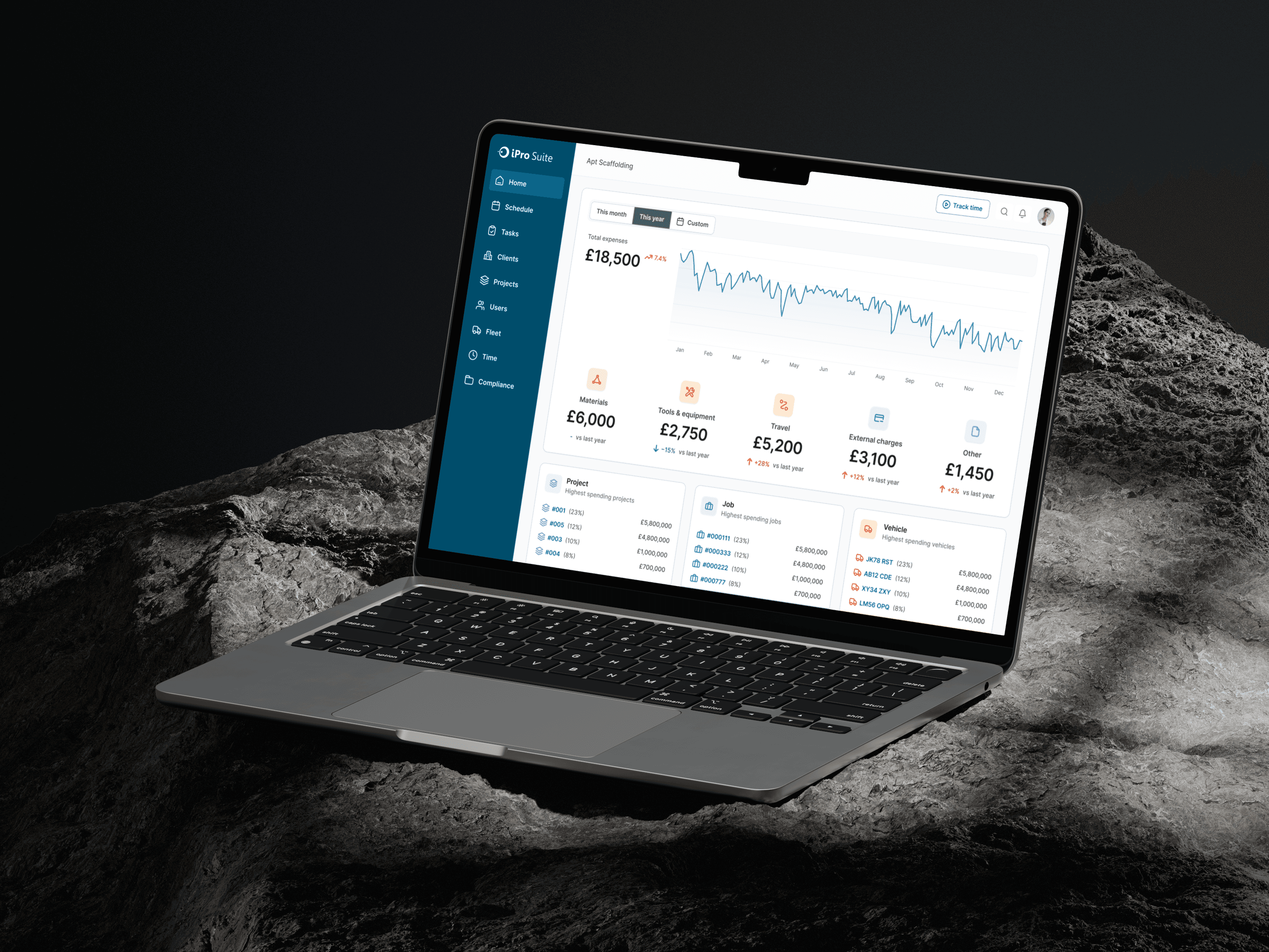
I redesigned the overview page to prioritize what matters most first: total expense trends, major expense type breakdowns, and top spending signals. Instead of overwhelming users with fragmented categories and dense reporting patterns, the new structure helps managers quickly understand overall spend before drilling into details. This shifted the module from “a place to input expenses” into “a place to understand spending.”
|
Drill-down by Top Spending Objects
To support cost attribution, I designed a drill-down layer that highlights the highest-spending projects, jobs, and vehicles. This allows managers to move from high-level trends to concrete business entities without losing context. The structure reflects a clear reading path: first identify where spending is rising, then locate which operational objects are driving it.
|
Unified Add Expense Flow & Directory Management
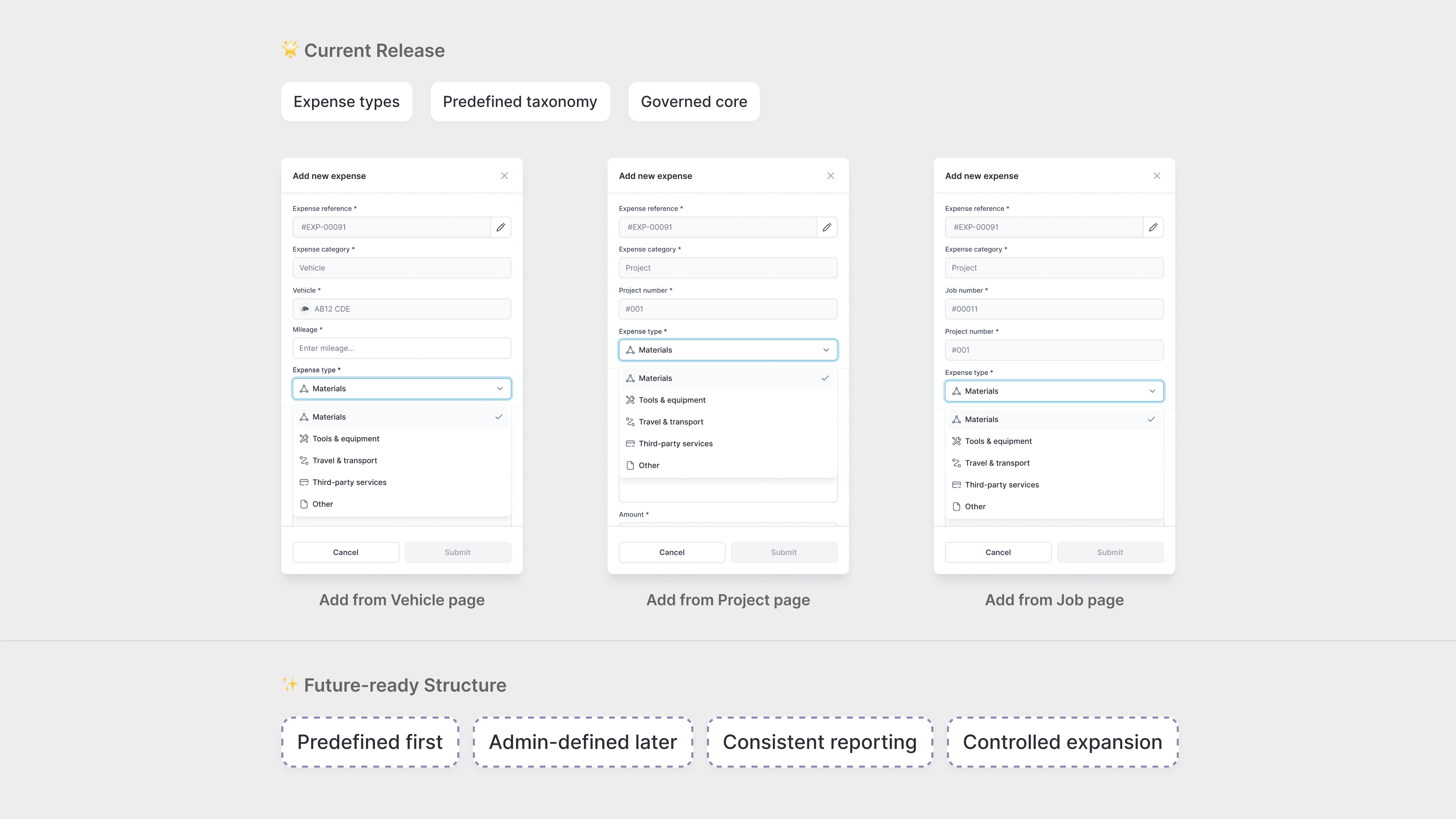
I redesigned the add expense flow and the expense directory into a more consistent system. The new flow clarifies fields such as expense type, related object, amount, date, and attachments, making manual entry easier and more structured. At the same time, the directory was simplified into a more stable table-based management view, improving scanability while staying realistic for implementation within the existing system constraints.
Most Memorable Moment:
I don't finish what shouldn't be started
The hardest thing I did on this project wasn't the design. It was deciding to go back.
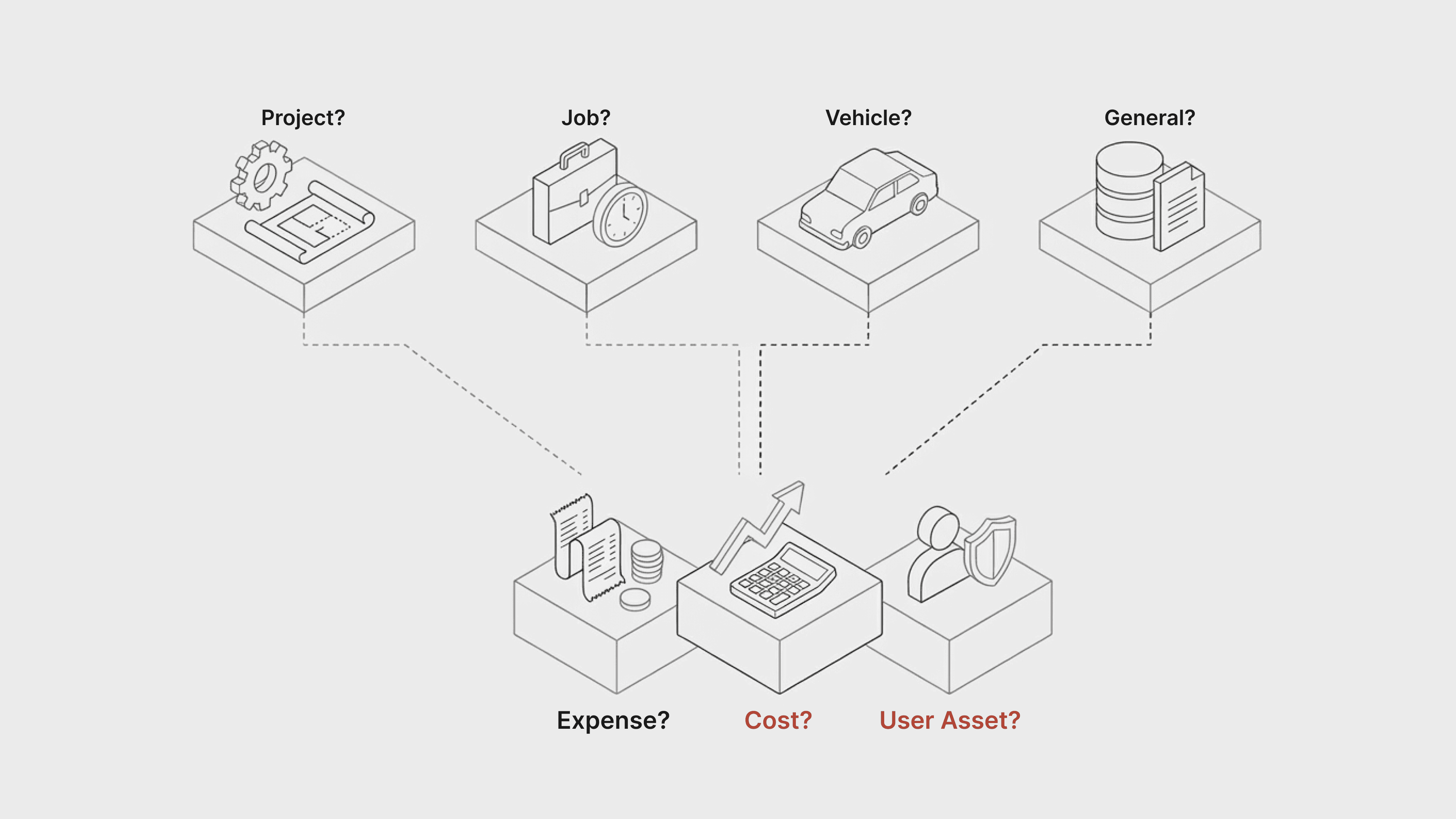
When I came onto the project, there was already a direction in place. Expenses would be categorized by Project, Job, Vehicle, and General: clean on paper, mapped to the backend, easy to defend in a meeting. Nobody was questioning it. So I went and talked to users. And the logic fell apart almost immediately: what I found was that the category structure wasn't just confusing, it was unfixable without starting over. So that's what I pushed for. I brought the user findings back to the team and argued for rebuilding the taxonomy before touching a single form. It wasn't a comfortable conversation. But the team moved in the right direction.
What I've learned is that the most expensive design decision is finishing something that was wrong from the start. My job isn't just to make the brief better, it's to catch when the brief itself is the problem. The earlier you say it, the cheaper it is to fix.
|
Impact
What We Achieved
Building an Expense System That Works the Way Field Teams Actually Think
Challenging assumptions
Stakeholder alignment
Research-driven strategy
Systems thinking
|
Section 1
The Room Was Moving. I Went Back
Dealing with ambiguity
Problem framing in business terms
Stakeholder interview
UX audit & heuristic evaluation
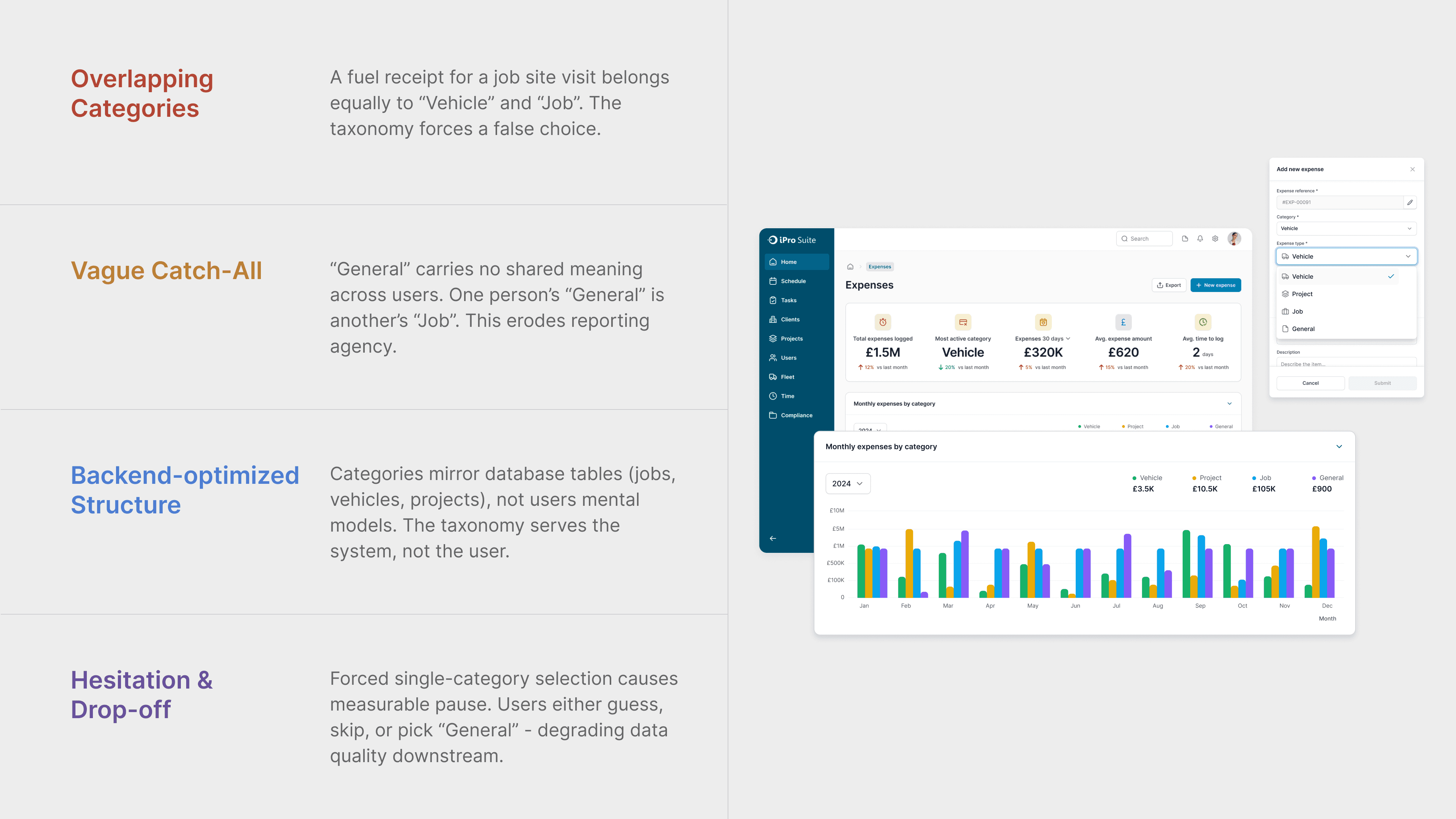
When this project started, there was already a direction in place, expenses categorized by Project, Job, Vehicle, and General, mapped cleanly to the backend, easy to defend in a meeting. I didn't start designing. Instead, I audited the existing product, ran stakeholder interviews with the CEO and managers, and mapped the conceptual boundaries between Expense, Cost, and User Asset to understand what the system actually contained. What I found was a set of overlapping concepts that would surface as user confusion the moment anyone tried to record a real expense. I learned that the most important design move is sometimes the one that slows everything down just long enough to ask whether the direction is right.
|
Section 2
Clean on Paper. Broken in Practice
Dealing with ambiguity
Data-driven design decisions
Concept ideation
Iteration
As discovery progressed, I brought the category structure directly to users, and it collapsed almost immediately. One fuel receipt could belong to a vehicle and a job at the same time, and when I asked what "General" meant, no one could give me the same answer twice. I brought these findings back to the team and pushed for a decision that wasn't comfortable: remove the Project/Job/Vehicle split, eliminate General as a standalone category, and rebuild the taxonomy around how users actually think about money spent on a job. The team moved. What looked like a categorization problem was a logic problem, and fixing the logic meant being willing to scrap the original plan entirely.
|
Section 3
I Design for What Comes Next, Not Just What Ships Now.
Design Handoff
Design Documentation
Feasibility Accessment
Post launch Analysis
Once the direction was clear, every structural decision I made carried a second question: will this block us later? I defined the boundaries between Expense, Cost, and User Asset not just to reduce current confusion, but to create a foundation that could support reimbursement workflows, approval chains, and receipt management down the road. I established a governance strategy, predefined categories first for consistency, with room for admin customization later — and documented the expansion points explicitly in the handoff so engineering knew where the system was designed to grow. I realized that designing for scalability isn't about predicting the future. It's about not closing doors you'll need to open.
|
Projects
|

